Reading the diagrams
The custom reports contain a box and beeswarm plots. This page explains how to read them.
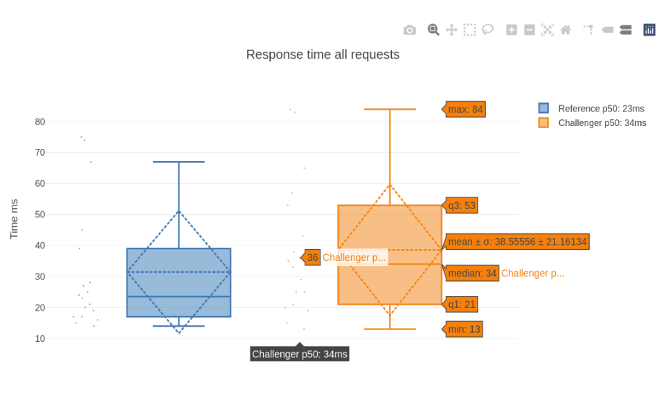
Box plot
The box plot (a.k.a. box and whisker diagram) is a standardized way of displaying the distribution of data based on the five-number summary: minimum, first quartile, median, third quartile, and maximum.
In the simplest box plot the central rectangle spans the first quartile to the third quartile (the interquartile range or IQR). A segment inside the rectangle shows the median and "whiskers" above and below the box show the locations of the minimum and maximum.
Bee swarm plot
A bee swarm plot is a one-dimensional scatter plot similar to “strip chart”, except that would-be overlapping points are separated by a jitter value, such that each is visible.
The below sample image represents one of the several boxplot charts, from the differential HTML report. In the case of the challenger, the IQR (interquartile range is from 21 ms to 53), median is 34 ms, with min and max being, 13 and 84 respectively. The bee swarm plot adjascent to the box plot, represents the overall distribution pattern, with x-axis value being randomly assigned by the jitter value to avoid super-impositions when there are many same y-axis data points.